 We all have them in our towns: 50s-era strip malls with parking in front, originally designed to be convenient to an automobile-oriented society. Simply drive in, get your products and services, and drive out. Not much walking, not much community feeling, and not much fun. These commercial strips become part of the gray blasé roadside we have to travel on our way to our destinations. We drive right by, generally ignoring them.
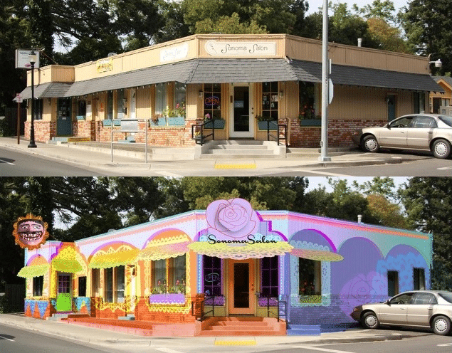
But what if, suddenly, all the commercial buildings in that strip exploded with color, cultural themes, and fun in a super-graphic and comprehensive statement that says, “Hey, check us out!” And what if it was all done with paint?
Now, expand this idea into a compelling, comprehensive, and super-graphic painting plan that addresses an entire region; a plan with dazzling colors that celebrate community and present a commercial message that invites the passers-by to stop and shop. Suddenly people will say, “Wow! Something new is going on! We drive by here every day and never noticed this before. We want to stop and check it out!”
This is the brainchild of accomplished designer, fine artist, and branding expert, Rico Martin at richImage.com . He calls it “the Springs wONEder Project” which unifies communities through creativity. It emphasizes that the whole is truly greater than the sum of the parts.
In the case of a somewhat run down area in Northern California known as ‘The Springs’, the daily impact on the thousands of passing car passengers is multiplied exponentially. The effect of ONE coherent color/cultural/commercial theme is transforming a dismal and neglected storefront neighborhood to an exciting destination and center of neighborhood pride.
Okay, so it took more than a few cans of paint!
Rico started with La Michoacana, a new Mexican-style ice creamery. The owner was excited to celebrate her love of color and her fresh fruit flavor desserts in the appearance of her store. After completing the interior of her store, she found out about a county-funded façade improvement program and suggested Rico use those funds to help fund part of the cost for new signage. But since her business was one of two commercial tenants in the same building, she suggested that Rico ask her business neighbor if she also wanted to have new signage – so the whole building would have a consistent look.
Then Rico and the ice cream shop owner walked the entire stretch talking to every merchant and invited them to a community meeting to discuss the Façade Improvement Program . At that meeting he presented an idea to bring color to this grey corridor of businesses. He showed the merchants successful examples where adding color greatly improved the economy of other commercial communities. After a very positive response, a number of the businesses commissioned Rico to design the facades of their stores using the idea of adding bright colors and a consistent design theme.
Then he spent the next 6 months designing the facades of 10 of the initial businesses, getting merchant and building owner approval, engaging a structural engineer to develop engineering plans, obtaining permits from the county, and finally securing the design fee element of the County’s Façade Improvement Program for which he was out of pocket the entire time.
Since his proposals were beyond the county’s budget for the program, he had to make it practical. He then put together a team of professionals who volunteered their time to make the plan possible. Then he presented plans to a number of local community organizations, county government agencies and officials before commencing work. Through a combination of efficiencies of scale, supplies donated from Kelly-Moore Paint, Graco and other local vendors, Rico was able to achieve a feasible and affordable plan that was win-win for everybody.
To see before and after of the designs and read more about the project, visit: www.woneder.org