 It’s so noisy out there that if you don’t use a style guide to keep your team on purpose, you’ll be lost in the competitive din! It’s hard enough to build a personal brand without scrutinizing every avenue of your communication. Whether it’s visual, audible, or content, all aspects of your brand communication have to support and enhance each other with a consistent style and method.
You don’t have the luxury to pursue multiple styles to get your message across. It’s too confusing, and you don’t really have your prospects attention long enough for them to shift gears and then put it all back together. They’ll simply get confused. The more you can reinforce all your messages with a consistent style, the better chance you have of building your brand.
Why? Because the real purpose of the brand is to create recognition. This means that your customers and prospects should easily identify and locate your business proposition.
This is doubly true in the consumer packaged goods space. When you create a branded product destined for sale in a retail environment, you are subject to the confines of the distribution and retail channel. You are subject to the physical limitations of the bricks-and-mortar store.
Consumer brand builders, attempting this arduous route, are trading off the relative simplicity of direct to consumer e-commerce for the benefits of broad physical distribution, brand recognition, tactile comparison, and volume sales possible in the retail stores. But that’s just it – it’s possible, not guaranteed.
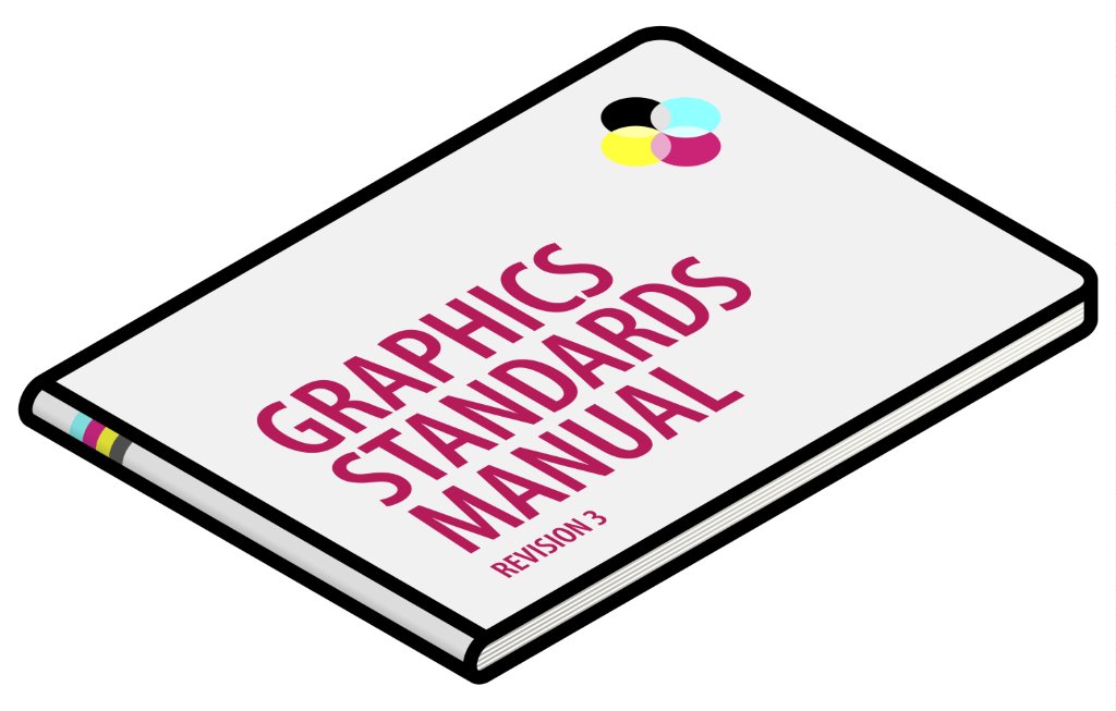
One way to achieve success at retail with your branded product is to adhere to strict brand guidelines. These guidelines should be kept in a written brand style guide. This manual specifically identifies the ways you want your brand portrayed in every aspect of communication. The idea here is to recognize that without a consistent message on all communication fronts, you are not doing all that you can do to give your branded product the full opportunity it needs to compete in the crowded retail marketplace.
Whether it’s your brand name, your logo, your font, your trade dress, your label, your package, or even your shipping carton, they all must be orchestrated and coordinated to match the theme of your brand. This orchestration can be articulated and verbalized in your brand style guide. Nobody on your team and no outside contractors should be allowed to develop any marketing materials without referring first and adhering to your brand style guide.
Solid Foundation
Because of our experience in the marketplace, we are forever being asked how to create a brand. We like to start with a firm foundation. It’s the foundation upon which the brand style guide is based. The first task we ask of our clients who are desirous of creating retail brands is simply, “In under 10 words, give us your catchphrase, mission, and slogan.” This forces them to summarize what they’re selling, why the customer should buy it, and how that message will get across.
For us at Barefoot Wine, our mission was, “Best Wine, Best Price.” “Best Wine” was validated by the number of medals in third-party contests. “Best Price” was the velocity price point, which is the price at which the greatest number of items in our category sold.
Our catchphrase was, “Get Barefoot and Have a Great Time!” where “Get Barefoot” was both a suggestion to buy the product and a suggestion to take off your shoes, relax, and have a great time. This was the foundation of the brand. All of the communication, in whatever form, had to deliver these two messages.
Let’s break it down. If you’re going to get barefoot and have a great time, that conjures up a fun, sunny, colorful, recreational, theme. It brings to mind the beach, the picnic, or relaxing barefoot by the fire. We used images that were consistent with this theme throughout our in-store advertising, on our products, and in our marketing content.
If you’re going to provide the best, that conjures up fonts, borders, trade dress, and quality queues that promote the theme of “best.” This may include, but is not limited to, gold foil, medals, awards, and fonts that exude quality and certification.
The purpose of a style guide template is to keep the brand messaging consistent. So first, you have to identify that brand message. The message itself can provide you with a big hint about what fonts, images, and subsequent support messages to use. Everything should be in the context of the mission statement and catchphrase.
Even if you are outsourcing the creation of your brand image, be sure to start with you mission statement and catchphrase. Try to identify styles in every aspect of your brand’s communication that are consistent with that basic foundation.
Rough Terrain
Remember, in the retail marketplace you don’t really have the time or the space to make a complicated or extensive statement. You don’t have your customers’ attention long enough to expect that they will recognize an inconsistently conveyed message and put it together that it is your brand. They need help. Use your style guide to identify the brand guidelines in all the categories and in all the choices where brand communication is to be made.
In the retail store your brand is just one of thousands. Your label typically is no larger than 3” x 4”. The lighting is overhead, not backlit like your monitor. Your label will be shaded by the shelf above it. Your customer is moving by at a rapid pace. How are you going to get her attention?
Your name, logo and label has to send a consistent and integrated message that helps her find and recognize your product.
Generally, retail is unforgiving. Messages must be clear, crisp, and concise. Logos must be legible, recognizable, and simple. Brand names must be under four syllables. Now, within that context, you are going to introduce a style. It better reinforce your mission statement and catchphrase. Nothing creates recognition like rote. That’s why it’s critical that all artwork and written copy conform to your brand style guide.
 Between Blob and Blur
At first, we thought we would use the same logo on our labels, cartons, advertising materials, business cards, website, and elsewhere. We thought we should be consistent for the reasons listed above. But then we ran into the realities of the distribution channel. Whereas we could use a fun, artistic, watercolor footprint as our logo on our labels, it simply wouldn’t work blown up on the sides of our cartons in a dimly lit warehouse. We had to grab the forklift drivers attention from 20 feet away to prevent mis-deliveries!
Sure, the fun artwork on our label was visible from 4 feet away in the store and 2 feet away on the dining table, but when it was blown up it was just a blur. We had to go to what we called a “cartoon” foot. It was a rudimentary solid foot, sans the artistic details in our label design, but it popped from 20 feet away. By the same token, if we used that simplified cartoon foot on our labels, our logo would just look like a blob from 4 feet away.
So then, we had to amend our brand style guide to specify how the logo was going to be used, under what conditions, and how far away it was going to be viewed! After a while we began to specify which logo design would be used for each purpose. We wound up with five different depictions of our logo. From labels to in-store advertising, from websites to company letterhead, we altered the logo slightly to maximize communication. But the footprint was always the same foot shape, at the same angle, and with the same number of toes!
We highly recommend that our clients spend more time in the retail store than they do in front of the monitor. We want them to witness in person what logos work well and why, and which ones don’t. The stores are full of examples of each. Don’t take your inspiration for a logo design from a list of logo examples on a website that offers flat, well lit, two-dimensional renditions. Instead, take your inspiration from logo examples that pop off the shelf in a retail store.
Style meets Practicality
In the harsh retail environment, fonts that are hard to read are counterproductive to sales. This means script, curlicues, and other complex styles may not be practical even if they are consistent with the brand mission and catchphrase. So there may not be a lot of room for artistic creativity when it comes to choosing a font that can be read from 4 feet away.
In fact, we discovered that non-serif fonts such as Ariel, Colibri, and Helvetica are the most effective at communicating from the shelf or from the warehouse floor. We had to create our own proprietary alphabet based on the “Broadway” font to demonstrate fun and communicate value without serifs, scripts, or curlicues. Our proprietary font was specified in our brand style guide.
We like to say, “When it comes to communicating in the retail environment, it’s more of a solution than a creation!” This means that your brand style guide must identify not only the specific shapes, forms, sizes, angles, and fonts that you will permit, but also those choices themselves must be practical when applied to the retail environment.
As your brand grows, many different folks are going to be involved in communicating the message. Don’t let them start from scratch! Don’t let them start thinking they have the freedom of a world of all possibilities. Give them your style guide template.
And don’t be afraid to change it as you go along. Improving your style guide to make it more practical is not the same as rebranding. But you can correct some of the mistakes you’ve made in the past on your next production run. When it comes to any changes or improvements in your label, logo, or package, we believe in evolution not revolution. Don’t confuse your customer!
Think of your style guide as a living, ever improving template to direct your marketing people to stay on message while communicating in the most practical way under the various conditions.
DNA Rules
Although your brand’s DNA is made up of several different components, including copy, tone, point of view, grammar, and even attitude, when it comes to retail brands, it’s primarily visual. Unless your using video kiosks or QR codes that take you to a video, you are most likely limited to how your product itself looks on the shelf.
Your style guide (also known as style manual) is the backbone of your brand’s DNA. It guarantees that even though your message is limited to a label on a can, box, bottle, or carton, it is clear and consistent, memorable and recognizable.
Over the years, we have witnessed many brands lose their market position and disappear because their acquirer’s marketing department violated the brand’s established DNA. The customers were confused, couldn’t find it, and even when it was right there in their face, didn’t recognize it! Brand DNA takes years to establish but can be lost in seconds. Acquirers would do well to respect their newly purchased brand’s established DNA. Like they say, “If it ain’t broke, don’t fix it!”
Your brand’s DNA is the familiar image and message that your customers have grown to expect from your product. It is communicated through artwork, design, messaging, and media. It’s very fragile. It’s hard to establish and it’s easy to lose. Protect it with thoughtful, current, and consistent brand guidelines.
Forbes has a great article on this subject. And Mary Stribley will take you through many examples of style guides. But now that you have heard our take on this vital subject, we invite you to go shopping! Look at every brand in your category in the store that catches your eye. Notice how their brand guidelines are either being accentuated or violated. Notice your own expectations about the brands you know and how those expectations are met with logo, label, font, color, and design. In other words, style! Think of it as a dress code for your brand. Now, dress for success!