 Changing your logo can be dangerous – especially after 18 years of stability, creating an identity with a customer base, and establishing a business around it.
Your logo is the flag everyone salutes whether they are your employees, customers, or advertisers. A sudden change can rock the boat, creating an air of instability, confusion and uncertainty.
But, after 18 years with the same logo, Yahoo took that gamble. We believe they are going to be successful with the new look. Here are the seven things that we think they did right:
1. Colors
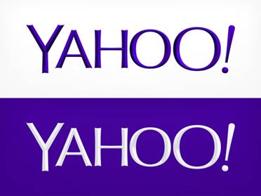
They kept the company’s official color, purple. This greatly mitigated the “shock” of transition and told their customer, “Yes, it’s new, but you are in the right place. The color is familiar to you and what you have grown to expect.”
2. Image
Logos can be images of objects, words, initials, or a combination. The simplest form for a logo is the word logo because of its clarity and the fact that it can be printed in a line of type copy along with regular words. They kept the word logo and did not create an object logo. So their name continues to be their logo. This is very powerful as it makes for easy recognition and recollection.
3. Font
This is where they made the most radical change. They went from an “Aw, shucks,” kind of hillbilly font to a cleaner, more businesslike sans serif font. The message is more sophisticated and professional.
4. Depiction
They kept the pictogram of the yodeling image they are famous for but changed the presentation from a bouncing, cartoony, explosive presentation of the letters to an echo-like presentation by subtlety wrapping the letters so that the beginning and ending letters expand out from the center. They also repeated the word and stacked it, so that the reader sees an “echo.” They even underlined the duplication of the message by reversing the purple and white in each rectangle.
5. Exclamation
They put their trademark exclamation point in italic, which subtlety balances the “Y,” which is slightly rocked back on the left side of the word. The italic gives the otherwise dignified and refined font action, and leaves the viewer with an upbeat statement that reflects back on the entire presentation of the logo.
6. Transition
They spent a month preparing their followers for a change. They used various depictions of the logo to soften the transition, some of which could be viewed as set-ups for the eventual and final choice. Of course, this is impossible in consumer products with printed labels, but is a possible and creative approach with virtual services.
7 Message
The overall message is “You are getting an upgrade!” not, “The new management had to put its mark on it.” This is important because brands and logos belong to the customer, not to the corporation, no matter what the marketing people think.
The jury’s still out on the new Yahoo logo. Will this new one last 18years like the last one? Or will it change again and again as the company tires of this logo every few years, and wants to “freshen up” its image? Is it a fad, a trend, a style, or is it a classic that will withstand the test of time?
Changing your logo is risky and can be downright disastrous, but in this case, we give high marks to Marissa Mayer and her team for respecting the time-honored expectations of her customers with sophisticated evolution, not disruptive revolution. Bravo, Yahoo!


