 Creating a logo for a CPG brand requires overcoming some specific and unique challenges of the retail marketplace. It’s not like creating a logo for your business card, company stationery, or email signature. Unlike those uses, in the CPG marketplace there is a ton of other logos out there competing to get noticed – and the retail environment itself eats logos!
You want to create a logo that satisfies the requirements of the bricks and mortar retail store. To do that, your final design must be more of a solution than a creation. Logo designers must solve the physical problems that can prevent their logo from being noticed at all.
So, it’s not how to create a logo given the world of all possibilities. It’s more like how to create a logo in a jungle of competing brands, unlevel playing fields, and arbitrary dynamics. And you have to make a logo that is eye-catching at the same time. We’ve seen hundreds of brands fail at this challenge because they tried to create a logo on the screen, surrounded by their friends who thought it was “cool,” and their eyes were never more than 18 inches away from their creation.
Any discussion on logo creation for a CPG brand should start with the landscape in which that logo will have to perform. By starting there, we can better understand the limited choices available to us in which to get “creative.”
1. Customer.
Most discussions on how to create a logo start with the message you want to send to your ultimate customer, the end-using consumer. That message must convey your brand identity, something about the product, something about the way the customer will feel using the product, or something about a particular advantage or distinguishing aspect of the branded product.
Your logo must become familiar to your customer at a subliminal level. It must be easy for them to remember and to recognize so they can locate it and buy it again. When people shop in bricks and mortar stores, most of them are choosing brands that have proven themselves. They are dependable, available, affordable, and deliver value for the price.
And shoppers make those choices rather quickly. They don’t go through the store, study every package, decide on a logo they like, choose that product in that category, and move on to the next category. Most shoppers can pick up 10 brands in less than a minute. So we are talking about very limited attention span where the logo is more of an aide to locate the product than to sell it in the first place.
Volumes have been written on how to create an eye-catching logo where your customers and potential customers are the targets of that design. They go on in great detail about the meanings of certain images, shapes, and colors. They discuss how your customer reacts to your logo design? This includes how your logo identifies with an image, feeling or an experience that your customer already has or wants? This is the creative aspect of designing logos.
For the purposes of this discussion, however, we will focus on the things we cannot change – the things that are already part of the retail environment. After those realities are addressed, then we have the luxury of creating effective eye-catching logos built on a solid foundation of practical reality.
2. Packaging.
In the CPG world, logos are primarily used on labels and on packaging and as such, need to be clearly visible, identifiable, and distinguishable. They must be eye-catching while still leaving room for all the other information required on your label. This alone is a big challenge.
In order for your logo to be easily recognized and separated from the required information, your logo should be relatively small and have plenty of “empty” or white space around it. Many logo designers don’t take this reality into consideration.
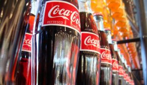
If your label is on a curved surface, like a bottle, a can, or other rounded containers, the portion that faces the customers’ eyes is relatively small in width. It may look great on your flat screen, but when it wraps around your product, if your logo is too wide, it will be out of sight and all that great design work will be for naught. This is a good reason why logos in the CPG space have to be small and compact.
What if your logo is applied to an uneven surface such as a plastic bag, blister pack, or other non-flat surfaces? Your logo must take the topography of your package into consideration. This is another reason for a relatively simple and compact design.
3. Distribution.
Whose eyes are you catching anyway? You may say, “Well, my consumer of course!” But that begs the question, “How does your branded consumer product get to your consumer in the first place?”
Do your products come packed in cartons, boxes, or bags? Do those containers passed through some kind of a distribution system? Are trucks, warehouses, forklifts, and other handling devices involved? If so, your logo must appear big, bold, and clear on your containers. It may be a good idea to repeat your logo on all sides of your product and packaging.
As a branded consumer product producer, your logo will be used to identify your products in dimly lit storage areas stacked with tons of other containers. We have witnessed hundreds of missed deliveries caused by confusion on the part of warehouse people, truckers, and store clerks. This is why you need a larger version of your logo on your shipping containers. You must do all you can as a producer to prevent confusion. Missed deliveries hurt your sales. It’s best to overkill on effective signage.
When those forklift drivers cruise down the aisle of a giant dimly lit warehouse at 5-10 miles-per-hour, make sure your logo catches their eye too, or else there’s a good chance you won’t have the opportunity to capture consumer’s eye. You eye-catching logo simply won’t make it to the retail shelf.
4. Shelf.
Finally, your branded consumer product made it to the shelf in that big box store! But don’t start celebrating just yet. There are some subtle challenges lurking on the shelf that can destroy logo designs.
Think your logo will be well lit in the retail store? It looked so sharp and crisp on the designer’s backlit display screen. But now you’re in a different environment. Now your logo has been reduced to fit on a label. And now it may be in the dark
The next time you go into a store look at the shelves. You will notice most of the products are pushed up to the front of the shelf. The overhead lighting in the store makes the logos on the labels look bright and colorful. But what happens when that first item sells? Are the other items automatically pushed forward to the front of the shelf? No! They stay put where they’ve been placed until a person merchandises the shelf and pulls the products forward and “faces out the shelf” again. This may take days!
So, you may find that, as a result of your own sales success, your branded products are back there in a hole! It likely will be quite a while before those products in the back are brought forward to the front of the shelf. But you still want to sell them, even if they are in a hole on the back of the shelf. Meanwhile, your logo is hard to read because it is not backlit like it was on the designer screen, and now, it’s not lit from overhead either. This is why it’s important that your logo has a simple shape, is surrounded by white space, and uses a compelling color to be eye-catching even when it’s way back on the shelf.
5. Position.
Where has your branded product been positioned in the store’s shelf plan anyway? Are you on the top shelf, eye level, hip level, knee level, or on the bottom? People tend to notice more logoed labels at eye level. People tend to favor brands positioned on the left side of the shelf. All of this has an impact on how your logo will be viewed.
For instance, when you’re a new branded product, you will typically be placed on the bottom shelf. Now you face double jeopardy. On the one hand, the shoppers in that store don’t know your brand yet and don’t even look for it. And on the other, you’re on the bottom shelf where they seldom look at all. Talk about the need for an eye-catching logo! This is why floor displays of new items are crucial to building familiarity with the customers for your logo. Keep it simple, crisp, and make it pop!
What competing branded products are to your immediate left and immediate right? These are the adjacent brands that are competing for eyeballs right next to your brand. You would do well to discover what other brands you will be grouped with, study their logos, and design a deliberately different and distinguishing eye-catching logo.
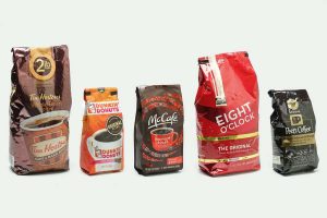
What are the most used colors in your category? If you look at the set of store shelves that your branded product will be displayed upon, squint your eyes, and see what color comes through. This is the color that is the most popular …this year. Look for what other colors pop out in this sea of sameness. That’s the “eye-catching” color you should consider for your logo.
6. Distance.
 When you design your logo, you and your colleagues will be close to the screen. You will be still and not whizzing by, 4 feet away, on your way to fill a shopping cart in 20 minutes. But your customer will be.
Designing a logo to be an eyecatcher for a customer like that reduces your options significantly. For instance, lots of frill and curlicues or fancy lettering will be lost in a blur. Logos that are too detailed or not simple enough will be seen as a dot, spot, or smudge. If your logo is cast on a colored background it may look just plain muddy.
Remember, the purpose of your logo is to help your customer identify your branded product and find it quickly in the collage of competing logos. So don’t try to be too fancy or to make some kind of a statement with your logo. Think of it as a sign, a marker, or an identifier that helps your customer remember your brand. It should help them quickly scan for it as they whiz along shopping for 50 other branded products.
Before designing your logo, go to the marketplace, grab a shopping cart, and move at 1 to 2 miles an hour down the aisle, and see what catches your eye. This exercise will give you some appreciation for the challenges involved in designing a logo that’s often no more than 2” x 2” from 4 feet away!
7. Competition.
You’re not the only one trying to use an eye-catching logo design. In fact, the store is filled with attempts to stand out and be noticed. How does your logo distinguish itself and stand out from the competition?
We faced this exact situation in the highly competitive wine industry. We knew our logo had to be eye-catching. We knew it had to distinguish itself. We also knew that we had to choose an image that was easy to remember, and something that everyone could relate to. We were told by a supermarket buyer that our logo should be the same as the name so that the combination of our name and logo would make it even easier for the customer to recognize and remember.
We chose the name “Barefoot” and the image of a bare foot. It was a shape and an image that was not in the marketplace, but one that everybody could relate to. It wasn’t that we were so clever. It’s that we asked supermarket buyers what they thought our logo should look like … and we listened! They told us what the parameters were within which we could be creative. We satisfied those parameters first!
If you want to know how to create a logo that will be eye-catching, spend some time shopping in the stores where you want your branded products to be. Think about these requirements we have just outlined. Look for eye-catching logos in that harsh retail environment. See how they did it. And don’t forget to ask the clerks, managers, buyers, salespeople, and even the warehouse people what logos they like and dislike …and why?
Then, when you make a logo you will be solving more than creating. The best eye-catching logos respect the retail environment and get through the distribution system. It’s not easy to make your slice of the pie stand out, because it looks like a pizza out there!


