 Especially with CPG brands on a crowded retail shelf or on a e-retailer’s page, your message had better be conveyed as short, powerful, and meaningful as possible. You only have a split second to catch your customer’s attention and relay your brand’s value. You don’t have enough time or space to go on about your features and benefits.
This usually comes down to your choice of graphics for your logo and label. These are the only pieces of marketing material that consistently make it to the store shelves. When you are selling at retail, the point of sale is the only place where your customer, your product, their money, and their decisions all come together.
Most shoppers new to your brand are moving by your products at 4 feet away in a poorly lit store. They ’re on their way to buy something else they are already looking for. Your only chance of being noticed is to stand out and grab their attention. Maybe you hope for a notion or impulse buy where your customer was not looking for your brand but saw it, was intrigued, and bought it for the first time? Maybe you have spent a bundle on a serious marketing campaign, and you hope your prospective customer will remember your brand from the ads and recognize it in the store?
What did they see that caught their eye? What did they see that looked familiar? It better be good, short, quick, and effective. It better pop, jump and convey something desirable about your branded product. You won’t be there to explain, they don’t have time to read or even notice your written materials. You have to communicate solely in some kind of graphic depiction that symbolizes what they are looking for.
To achieve this rather difficult goal, you must work within the established ground rules that existed before you ever got there, rules that apply to every CPG brand in every retail store, rules that have to do with the physical landscape. These include, but are not limited to, the store lighting, the distance your customer is from your products, and more specifically, your label. These also include the location of your products on the shelf or on display, the size of your label and the way your label lays on the shape of the surface of your package. At the same time, you also must rise above the crowd of competitors attempting to do the same thing!
So, now we are talking about noticeably conveying your value proposition from a relatively tiny space with several limiting conditions. So far, this is more of a solution than a creation. But understanding and respecting the conditions under which you will attempt to convey your message is critical to your success!
Sitting in front of a flat surfaced, backlit screen with your friends 2 feet away is not going to get it. No matter how “cool” you all think your new logo is, it must abide by the harsh physical rules of the retail environment. The question is, “How does it look on your package from 4 feet away with overhead lighting and surrounded by the other competing labels and logos?” Is it still “cool?”
Once you have accounted for all the limitations of the retail environment, then and only then do you have the luxury of creating your logo and label. And as mentioned, you don’t have time or space to convey your message in writing, so you must convey it in symbolically. You must discover a graphic representation of your value proposition that can stand up to that environment and still get your message across.
The Oxford Dictionary defines “symbolism” as “The use of symbols to represent ideas or qualities,” where the word “symbol” is defined as a mark or character used as a conventional representation of an object, function, or process, e.g., “the letter or letters standing for a chemical element or a character in a musical notation.” For the purposes of our discussion on symbolism as it applies to consumer-packaged goods’ logos and labels, let’s explore 5 popular types of symbolism:
1. Name Symbolism. The name itself identifies the quality conveyed.

Certain brands like Heinz, Kellogg’s, and Baileys convey their market strength, product, category and quality just because they have been around so long. They have associated their family name with the products they represent. They have established their brand reputations over decades. So, they have the luxury of using their name itself as a symbol. They have developed proprietary fonts to distinguish themselves in the marketplace. Due to history and traction, their names are memorable, recognizable, and familiar to their customers, whether first-time buyers or loyal fans.
But that’s not the case with new brands. Their family names are unknown and need time to become established. Choosing a family name for a new CPG brand is an uphill battle. And with all the other battles you have to fight, avoid adding this one to the list.
Another form of name symbolism is to use a word that communicates a feeling your customer will experience, some positive attribute of your product, or a description of the product itself. New brand builders may have more luck gaining traction with words that are what the customer is already looking for. These words may incorporate a descriptor of the product, like Kleenex for tissue, conveying the “clean” message. Saran Wrap is a hybrid, using the family name but identifying the product itself (plastic wrap).
Still another method of name symbolism is to use initials, abbreviations, or special fonts to distinguish your brand. But again, these abstract and subjective types of brand names are unknown to new customers. Without huge advertising campaigns, it can take years for the marketplace to recognize and associate them with your products.
2. Shape Symbolism. The shape of the logo conveys an attribute of the product.
All shapes should be crisp, clear, and readily recognizable. For instance, If the attribute you want to distinguish your product is fragrance, perhaps a flower would be a good choice to symbolize that attribute. People already attribute a flower with fragrance, so, it is familiar and easy to associate with your product. If the attribute you want your customer to associate with your product is speed, perhaps a wing or a bolt of lightning, and so on.
But again, you are up against the requirements of the retail environment, so just any shape won’t work. Only those shapes that can be seen and recognized from 4 feet away will be recognizable in poor lighting. Only those shapes that will fit on a label and still leave room for the required information will be recognizable. Otherwise, all your expensive artwork will look like a blob or a dot and your customers will pass you by.
Nothing is more frustrating for your customer than to want your product but not be able to find it. The shape you choose is a utility to help them find it. The further they are way and the faster they are moving, the more clear and simplified your shape has to be to do its real job – identification.
For instance, the shape of your logo may be deliberately different to be read in a warehouse compared to a store shelf. In the warehouse, the lighting is generally dim. The forklift operator is moving faster than the shopper and is further away. In this instance, it’s the shape of your logo on your carton that the forklift driver sees. Perhaps here, a simplified version, more silhouette like, would be easier to read when blown up on the sides of your carton. Logo shapes on cartons are also critical to being notices in floor displays of your products when you want to grab attention from 20 feet away or more.
3. Shape and Name Symbolism. The power of redundancy reinforces your name recognition.
Choosing a symbol for your logo that is the same as your name is very powerful in the marketplace. It’s hard enough to remember a name. It’s easier to remember a shape. But when the two are combined, you get a double whammy where the whole is greater than the sum of the parts.
At Barefoot Wine, for instance, we chose the brand name “Barefoot,” and also the shape of a foot as our symbol and logo. This reinforced our brand name in the minds of our customers. People already do this every day. They try to symbolize someone’s name whom they just met with a picture, image, or shape. Why not conveniently give it to them? They will not only appreciate the “memory aid,” but they will better remember your brand!
The marketplace is full of these examples of names enhanced by an image of the name and for good reason. You don’t have much time to be memorable, so do your best. Having an image different than your name is just confusing the situation and forcing your customer to remember one or the other. So, why not use both?
4. Style Symbolism. The style of the symbol conveys the value of the product.
The font you choose for your brand name can used to convey a certain desirable attribute of your brand. Some examples may include dependable, speed, old-fashioned, modern, soft, strong, fun or long lasting. For instance, if your branded product is made in a classical way, you may want to choose a classic font. You may want to choose a classic image as well to amplify the message.
Brands that use abbreviations or initials for their brand name can also benefit by stylizing their fonts. In this case, custom fonts can not only communicate the message but they can help the customer visualize some desirable quality you want to symbolize. All of this provides the memory with more queues to recognize and identify your brand which has a big impact on sales.
Minimalism has been the style of favor for the past decade in technology, ands seems to work for tools as well, but when you get into food or beverage or even certain dry goods, it may not be appropriate. Style should enhance your message, not be your message.
The style of the trade dress you use to advertising your brand can also remind your customer about your identity, helping them to further recognize and remember your brand and its characteristics. Ideally, all your choices of style should be consistent and complementary. You want to reinforce the message with a style that enhances the message.
5. Color Symbolism. Color conveys the emotion you want to evoke and helps identify your brand.
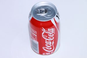 Colors symbolize various messages when used in different situations. Red is probably the first that comes to mind. It’s the color of blood, the color of many flowers, and it’s the color of the stop sign. It is associated with love, with warmth, and sometimes with hostility. It is warning, alerting, and demanding attention. It’s one of the so-called advancing colors. In the marketplace, it’s very effective in standing out. Unless of course, all the other competing brands are using it, then anything but red seems to get noticed.
With color in the marketplace, we see trends from year to year as brands try to get noticed. When one color seems to work for a while, others are quick to copy it and the choice becomes less and less effective.
Also, unlike name, shape, or style symbolism, color symbolism can be applied to your label, whole package, or parts of your package, to tie in the color theme. In retail stores, customers often ask for a particular branded product by its color. “I’m looking for the one with the yellow label,” they’ll say, completely forgetting the name or the logo.
Colors should be used judiciously and effectively. Avoid too many colors, watercolors, or any collages that may muddy out from 4 feet away. Keep it simple with just one or two colors.
The color blue in the marketplace conveys clean, pure, and fresh, like the sky; green says calming, natural, and earthy, like the grassy meadows; yellow is conveys fun, bright, and cheery, like the sun; gold represents value, prestige, or heraldry, like a gold nugget; black is used for definition, formality, or elegance, like a tuxedo.
These are just a few basic examples of color meanings but there is no end to the kaleidoscope of possibilities when using colors in tints, screens, combinations, or as backgrounds. You can choose colors that are advancing vs. receding or attention-getting vs. calming. Just remember you don’t have the world of all possible choices to choose from. You must satisfy the demands of the retail environment. Due to the various types of lighting, what works in the marketplace may be very limited.
These different types of symbolism should be carefully orchestrated to achieve a very specific goal: To help your customer recognize, remember, and locate your brand from the crowded shelf. For the best education in symbolic association, go shopping! Notice what’s going on with the symbolic messaging and you will soon say, “I get the message!”